
Image as data: Automated visual content analysis for social science
Images contain information absent in text, and this extra information presents opportunities and challenges. It is an opportunity because one image can document variables with which text sources (newspaper articles, speeches or legislative documents) struggle or on datasets too large to feasibly code manually. Learn how to overcome the challenges.

Build good practice in reporting Thematic Analysis recording & resources
In this webinar, Virginia Braun and Victoria Clarke, the authors of award-winning textbook Thematic Analysis: A Practical Guide, explore good practices in reporting thematic analysis (TA) - particularly for the reflexive TA approach they have developed.

Communicate the story of your research using video abstracts
As a researcher, you have an important story to tell, one that can have a positive impact on society. Whether it’s a public health message or a novel technique to share with your peers, everyone is better off when your work is visible.
But academic articles are a tough read and discourage most people. So how do you engage your peers and the public while shining a light on your research?

Looking for inspiration for your next scientific conference poster?
A well-designed scientific poster tells everyone in the hall a lot about you: about the way you present your work, about your skills in graphic design, about the amount of effort you put into your story. Your poster is your story!

How to choose a colour scheme for your scientific poster
Making an effective scientific poster is about standing out from the crowd and presenting your hard work in the best light. But choosing a cohesive, eye-catching and stylish colour scheme is easier said than done. With no help from your design software’s default colour palette, and infinite colours to choose from, it can be overwhelming.

Creating a graphical abstract for your next paper
New research papers are being published every day. In fact, 2.6 million papers are published every year. But let's face it; nobody has the time to read abstract after abstract to dig out what you need from all the papers out there. So how can we digest a large amount of information in a shorter span of time? Here's where “graphical abstracts” come in to make every researcher’s life easier.
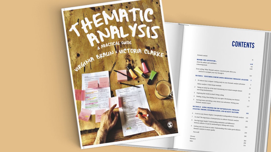
Thematic Analysis webinar recording now available
In this webinar, Virginia Braun and Victoria Clarke, celebrate the publication of their new book Thematic Analysis: A Practical Guide. Joined by fellow academics, Nikki Hayfield and Gareth Terry, they answer questions about their work on this groundbreaking new method of qualitative analysis.

Thematic Analysis: in conversation with Virginia Braun & Victoria Clarke
Ahead of their webinar on 16th November (GMT), 17th November (NZ) we caught up with Virginia Braun and Victoria Clarke to discuss their new book, Thematic Analysis, A Practical Guide, using social media as an academic and changes within qualitative research in Psychology.


From Princeton to London via Chicago: My Summer Institute in Computational Social Science journey
Continuing our series on the Summer Insitute in Computational Social Science, Joshua Becker traces his SICSS journey.
Before I get into this, you should know I’m a network researcher. So even though this is ostensibly about a summer program, it’s also about networking. I almost didn’t participate in the Summer Institute in Computational Social Science, or SICSS as I now know it fondly. At the time, I thought it was just about learning the skills — and I felt I had a solid methods foundation — and mainly just applied because it seemed like the kind of thing I was supposed to do as a grad student. Having never previously seen the gorgeous Princeton campus, I imagined the trip itself as little more than spending two weeks in suburban New Jersey rather than at home with my wife. Luckily, I applied. And luckily, I was accepted. Mileage may vary, but I made out well on the deal.
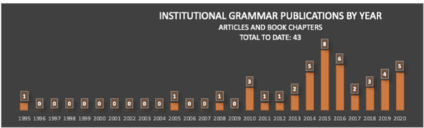
Understanding institutions in text
Institutions — rules that govern behavior — are among the most important social artifacts of society. So it should come as a great shock that we still understand them so poorly. How are institutions designed? What makes institutions work? Is there a way to systematically compare the language of different institutions? One recent advance is bringing us closer to making these questions quantitatively approachable. The Institutional Grammar (IG) 2.0 is an analytical approach, drawn directly from classic work by Nobel Laureate Elinor Ostrom, that is providing the foundation for computational representations of institutions. IG 2.0 is a formalism for translating between human-language outputs — policies, rules, laws, decisions, and the like. It defines abstract structures precisely enough to be manipulable by computer. Recent work, supported by the National Science Foundation (RCN: Coordinating and Advancing Analytical Approaches for Policy Design & GCR: Collaborative Research: Jumpstarting Successful Open-Source Software Projects With Evidence-Based Rules and Structures ), leveraging recent advances in natural language processing highlighted on this blog, is vastly accelerating the rate and quality of computational translations of written rules.

Istanbul as a regional computational social science hub
Summer Institute in Computational Social Science (SICSS) Istanbul was originally conceived in Oxford and Helsinki. Our co-organizer, Akin Unver, and the principal data scientist tutor, Ahmet Kurnaz of SICSS-Istanbul met at Oxford University in 2017 during their joint research project on how best to use data science to gather data from hard-to-access regions such as disaster areas or war zones. From this project arose the need to launch a data science summer school in Istanbul. Our teaching assistant (Yunus Emre Tapan) was then a participant at the SICSS-Helsinki, run by our other co-organizer, Matti Nelimarkka, and also discussed the possibility of launching an Istanbul chapter. Later in 2018, Akin and Emre met at the International Studies Association annual meeting for the first time and agreed to launch SICSS-Istanbul.

Uncovering new keys to countering anti-Black racism and inequity using computational social science
A new Summer Institute in Computational Social Science organized by Howard University and Mathematica promises to bring the power of computational social science to the issues of systemic racism and inequality in America. This marks the first time the successful SICSS model is being hosted by a Historically Black College or University.

text: An R-package for Analyzing Human Language
In the field of artificial intelligence (AI), Transformers have revolutionized language analysis. Never before has a new technology universally improved the benchmarks of nearly all language processing tasks: e.g., general language understanding, question - answering, and Web search. The transformer method itself, which probabilistically models words in their context (i.e. “language modeling”), was introduced in 2017 and the first large-scale pre-trained general purpose transformer, BERT, was released open source from Google in 2018. Since then, BERT has been followed by a wave of new transformer models including GPT, RoBERTa, DistilBERT, XLNet, Transformer-XL, CamemBERT, XLM-RoBERTa, etc. The text package makes all of these language models and many more easily accessible to use for R-users; and includes functions optimized for human-level analyses tailored to social scientists.
Unbundling the remote quantitative methods academic: Coolest tools to support your teaching
This year’s lockdown challenged the absolute core of higher education and accelerated or rather imposed the adoption of digital tooling to fully replace the interactivity of the physical classroom. And while other industries might have suffered losses, the edtech space flourished, with funding for edtech almost doubling in the first half of 2020 vs 2019. Even before the pandemic, lecturers were starting to feel overwhelmed by the amount of choice to support their teaching. More funding just meant more hype, more tools, and more tools working on similar or slightly improved solutions, making it even harder and more time-consuming to find and adapt them in a rush.
Below, we take a look at several tools and startups that are already supporting many of you in teaching quantitative research methods; and some cool new tools you could use to enhance your classroom.
What a year...Here are our top posts of 2020: From text mining tools in the social sciences to running online experiments and visualizing COVID-19 data
The SAGE Ocean Blog started the year off with a piece on our recently published white paper on software tools for social science. Next week we’ll publish a piece from senior product manager Daniela Duca on the challenges of running social science experiments from home and what tools can help. The move to online teaching, learning, and research feature heavily in our top posts of 2020. Back in April Katie Metzler wrote about the challenge COVID-19 to student research projects and in May, Jason Radford provided some helpful recommendations for translating studies into an online format and recruiting virtual participants.

Coordinating global cities research: Knowsi case study
“We haven’t met yet. Do you trust me?”
This is the dilemma that any researcher faces at the outset of their recruiting process — to find people who are willing to share their stories, experiences, frustrations, and victories with a total stranger. The secret to building trust often comes down to explaining in person while performing the interview — creating a rapport with the research participant and listening deeply and critically to their stories.

Life on the screen
As technology becomes more integral to everything we do, the time we spend in front of screens such as smartphones and computers continues to increase. The pervasiveness of screen time has raised concerns among researchers, policymakers, educators, and health care professionals about the effects of digital technology on well-being. Despite growing concerns about digital well-being, it has been a challenge for scientists to measure how we actually navigate the digital landscape through our screens. For example, it is well documented that self-reports of one’s media use are often inaccurate despite survey respondents’ best efforts. Just knowing screen time spent on individual applications does not fully capture a person’s usage of the digital device either. Some could spend an hour on YouTube watching people play video games whereas others might spend the same amount of time watching late night television talk shows to keep up to date with the news. Even though the screen time is the same for the same application, the intentions and values of consumption of certain types of content can be vastly different among users.

When reading a visualization is what we see really what we get?
When reading a visualization, is what we see really what we get? There are a lot of ways that visualizations can mislead us, such that they appear to show us something interesting that disappears on closer inspection. Such visualization mirages can lead us to see patterns or draw conclusions that don’t exist in our data. We analyze these quarrelsome entities and provide a testing strategy for dispelling them.

The validity problem with automated content analysis
There’s a validity problem with automated content analysis. In this post, Dr. Chung-hong Chan introduces a new tool that provides a set of simple and standardized tests for frequently used text analytic tools and gives examples of validity tests you can apply to your research right away.